I remember I first saw this polish on Chalkboard Nails about a year ago and was absolutely smitten. However, I have to say I was just a little bit disappointed when I finally got it and put it on, because I think they must have changed it. The glitter is really dense, which I normally like, but one of the things I'd liked about Ab Initio when I saw it on Chalkboard Nails was that the glitter was sparse enough that you could really see the different layers of glitter glow through the deep purple jelly base. While I still really like this polish and am glad I bought it, I am a bit disappointed because it wasn't how I expected. I could layer it with another purple jelly, but my only purple jelly is Milani Rad Purple, which isn't the right color at all. But I have no objection to expanding my purple jelly collection... ;) Any suggestions?
Showing posts with label silver. Show all posts
Sunday, January 5, 2014
January Nail Art Challenge Day 1: Ab Initio
I remember I first saw this polish on Chalkboard Nails about a year ago and was absolutely smitten. However, I have to say I was just a little bit disappointed when I finally got it and put it on, because I think they must have changed it. The glitter is really dense, which I normally like, but one of the things I'd liked about Ab Initio when I saw it on Chalkboard Nails was that the glitter was sparse enough that you could really see the different layers of glitter glow through the deep purple jelly base. While I still really like this polish and am glad I bought it, I am a bit disappointed because it wasn't how I expected. I could layer it with another purple jelly, but my only purple jelly is Milani Rad Purple, which isn't the right color at all. But I have no objection to expanding my purple jelly collection... ;) Any suggestions?
Tuesday, February 28, 2012
China Glaze Capitol Colours: Stone Cold
Helllooo! Today I'm reviewing Stone Cold, one of the colors I received from the China Glaze Capitol Colours collection. Stone Cold is a matte, metallic gunmetal-colored polish, and I have to say, I'm a huge fan. I wish my nails were less nubbiny so they could show off the polish more, but c'est la vie, so here are the nubbiny pictures I have:
sunlight
indoors, natural light
Isn't she gorgeous? I'm really keen to do some kind of sponge like this...I feel like it would be a really good color to sponge. Then again, I've been on a sponging kick lately, so maybe it's just me. Anyway, to get off my tangent, let me tell you some more about Stone Cold. Not only it is an awesome color with an awesome finish, it's really easy to apply and is perfectly opaque in one coat. ONE coat, people! What can I say, I'm impressed.
The next color I have from Capitol Colours is Dress Me Up, so you'll be seeing that soon (though I hope to get a few more when they come out for sale - *cough* Riveting *cough*), though I may have a post or two in between. Also, midterms are next week, so I may have to slack off a bit on the blogging. I'm determined to get good scores on my midterms, so I'll be hitting the books hard (at least, that's what I think now). Until next time, have a good day!
Stone Cold was received by me from China Glaze for review. For more information, see my disclosure policy.
Tuesday, December 20, 2011
SinfulColors Holiday 2011 - Swatches & Review
Good morning! I took my last final this morning for my political science class, and now I'm done! My mom's not going to be here until this afternoon because of work, though, so I thought I'd take this opportunity to post the SinfulColors holiday collection that I swatched Saturday. The collection is made up of five repromoted colors and two stripers. Although none of the polishes are new, they're all new to me, so I was pretty excited to try them out, especially with all the good things I've heard about Daddy's Girl. I do have to apologize, though - my nails were really short to begin with, and then my pinky nail broke halfway through swatching, so the last half only have three fingers. Sorry!
sunlight
shade
Sugar Sugar, described by the SinfulColors press release as "a candy cane, red-hot tint," is just that - I love the color, and the glowy quality reminds me of my favorite red shimmer, Dr.'s Remedy Revive Ruby Red. The only thing I didn't like was the formula, which in combination with the brush was very hard to control, and as you can see, I ended up getting some bubbles. With a little more care, though I don't think this would happen. I used two coats.
sunlight
shade
I decided to show Flower Girl next because I used it on top of Sugar Sugar. It's a bronze-gold color that I haven't seen in a striper before, which is really nice - I always like to find something unique. It was also really opaque, which is essential in a striper because it's more of a pain (for me, at least) to go over stripes twice. It's worth noting that the brushes on these stripers are thicker than Kiss or Nubar, but I don't necessarily think that's a bad thing; after all, it can be good to have some variety.
sunlight
shade
Next, we have Midnight Blue, "a bold, bright twist on navy," or what I'd call a vivid, medium-blue shimmer. This polish kind of reminds me of Sally Hansen Blue It, but brighter and less metallic. I used two coats with this as well, but was more careful and only got a couple bubbles, though it was still a bit of a pain to apply. I like Midnight Blue, but I don't think it's a must-have.
sunlight
shade
This is the second striper, Fashionista. It's a silver glitter, and to be honest, I was a bit disappointed with this one. The base was thicker than I like in stripers, and the glitter wasn't as dense as I had hoped it would be. However, if this is your thing, I would definitely recommend it - after all, it's cheap and easy to work with.
sunlight
Sorry I don't have a shaded photo for this one - I didn't realize until I uploaded them that all the ones I took were a little blurry, so I decided not to include one. Anyway, Last Chance is a dark evergreen creme that seems to me like a non-jelly version of Nars Zulu. As I've never been a huge fan of Zulu (I don't tend to love vampy polishes), I'm perfectly happy with Last Chance. I used two coats.
sunlight
shade
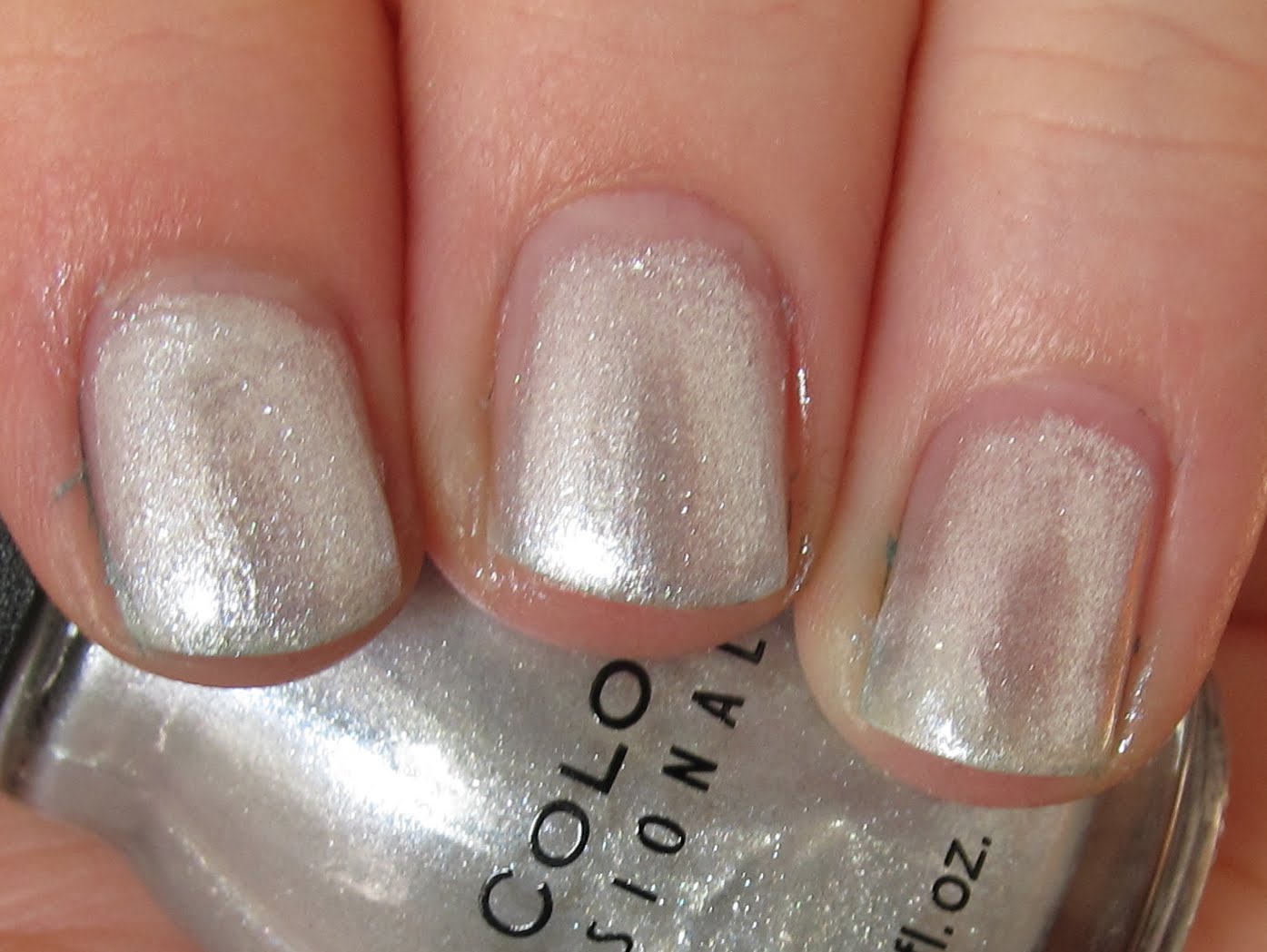
As you can see, Out of this World is a whitish silver, and I have to say, I'm not a fan of this one. It wasn't quite opaque with the three coats I used, and it's not really a color I would wear on its own. I think it might be good for layering, though...I'll have to try that sometime.
sunlight
shade
Daddy's Girl, "a deep purple with a drizzle of shimmer and glitter," is by far my favorite of these. It's a gorgeous purple jelly with gold glitter, and I love it. It's not quite opaque with three coats, but it's more opaque than it looks in my first picture. I'm not sure why I didn't buy this one before...it's a vivid purple; what was I thinking?!
If you'd like to buy any of these for yourself, you can find them for $1.99 at mass retailers like Walgreens.
And with that, I need to go pack...I hope you're all having a great week, and don't forget to read my NO H8 post!
These products were provided to me by the manufacturer for honest review.
Tuesday, November 29, 2011
Dr.'s Remedy Jolly & Joy Swatches and Review
Hello again! I'm back, as I said I would be, with the holiday 2011 collection from Dr.'s Remedy. I know for sure that one of these, Revive Ruby Red, is a re-promote because I reviewed it before, and I think Passion Purple is as well; however, I'm fairly sure the other three are new - but by all means, correct me if I'm wrong! Now, let's get to the polish.
outdoors, sunlight
First, we have Revive Ruby Red, which as I said before, is not a new color - it was in last winter's collection as well. However, that doesn't make it any less gorgeous! If you read my original review, you will remember that I absolutely loved it then, and that definitely hasn't changed. It's got the same lit-from-within, glowing quality that made it love me so much the first time around, and is opaque in the same two easy coats. I encourage you to read my previous review of Revive Ruby Red for more details if you're interested.
outdoors, sunlight
The second color in Jolly & Joy, Passion Purple, is described by Dr.'s Remedy as "a bombshell-boysenberry with subtle silver meshed throughout," and I think that's an accurate description. I tend not to like shimmers with a colored base and silver shimmer quite as much as other shimmers, but I think this one is nice. I'm not wowed by it, and I'm not sure that I'd wear it all that often. However, if this sort of finish is your thing, go for it! The application was fantastic, and it got opaque coverage in two coats.
outdoors, natural light
Essential Emerald, the third polish, is described by Dr.'s Remedy as "a take on the classic tree-and-plant-inspired gem of a shade, with delicate glimmer and unparalleled amounts of glamour." Now, this is an area where I really have to disagree with the description - to me, this is a jade green, not an emerald. However, it is a very lovely color, and I like the silver shimmer in this better than that in Passion Purple. This one also took two coats, and the application was great.
outdoors, sunlight
Serene Silver Glitter is described by Dr.'s Remedy as "a seasonal sizzler like no other: shine, chic, totally unique in the metallic scene," and on this one, I totally agree. As far as I know, there really is no other polish like this one. For one thing, it's definitely a glitter, but the particles are so fine that it applies almost as smoothly and evenly as a foil, and looks a somewhat like a foil on the nail as well. Additionally, it has not only silver glitter, but red and blue as well, which is a combination I haven't seen anywhere else. Best of all, the glitter is very highly packed into the polish - I barely needed two coats!
outdoors, natural light
Finally, we have Resolution Red Glitter, "a red-meets-copper spin that's sequin-look-alike laden with high-shine and sparkle." I sort of see where they get the copper, but to me, the polish is mainly a red, pink, and silver glitter. It also barely needed two coats, and the application was good.
Check Dr.'s Remedy out on Twitter and Facebook!
http://twitter.com/#!/remedynails
These products were provided to me by Dr.'s Remedy for honest review.
Thursday, July 14, 2011
We Are the D.A.

Both pictures were taken indoors under artificial lighting. I used Wet n Wild White Creme for the base on the thumb and China Glaze First Mate to write "D.A.." On my other fingers, I used First Mate with two coats of Icing Electric Feeling on top for the base, and on all the fingers I used Sally Hansen Xtreme Wear Celeb City for the splatter.
The writing didn't turn out nearly as well as I would've liked, but I must say that the splatter looks much better than I'd hoped. This was only my second splatter mani (you'll probably see the first sometime next week), so I was very happy with how it turned out. Since SLU's colors are blue and white, I may do something similar for Welcome Week...
Labels:
blue,
harry potter,
nail art,
silver
Saturday, July 2, 2011
Silver Crackle Comparison
I know some of you out there are tired of crackle and wish it would go hide in a hole somewhere - if that's you, skip this post. I got Sally Hansen Fractured Foil a while back and thought that would mean I didn't need to spend the money on OPI Silver Shatter. Then I kept seeing Silver Shatter in stores, and I thought, "You know, I'm pretty sure that's a darker silver than the Sally Hansen." And so, of course, I inevitably bought it. And you know what? They are different! I was delighted. I compared them first over a dark color (I used Cult Nails Living Water, because I was wearing it already and it's practically black) and then over white (Wet n Wild White Creme). No bottle pics, because the ones I took turned out horribly. Both pictures were taken indoors under artificial light.
pointer and ring - Fractured Foil, middle and pinkie - Silver Shatter
As you can see, there's not that much difference here, though Silver Shatter does look slightly darker. The contrast showed up more in real life, but it still wasn't remarkable. But when you put them over white...
pointer and ring - Silver Shatter, middle and pinkie - Fractured Foil
Okay, now there's a big difference! Silver Shatter is closer to a gunmetal silver color, while Fractured Foil is a pale silver. Since I'll be wearing these over light colors as well as dark, this definitely justifies owning both of them for me. If I manage to get my hands on the silver China Glaze crackle, I'll do a new post comparing them all, but I'm not holding my breath - the only reason I got my hands on the original set of Crackle Glaze is thanks to the lovely Jasmine of Colour Coated.
Do you own either of these? And which do you prefer?
Labels:
crackle,
metallic,
opi,
sally hansen,
silver
Monday, May 30, 2011
Grey-Blue Gradient
Happy Memorial Day! If you're American, be sure to take today as an opportunity both to honor the courage of those who serve in our military...and to eat some great food. :) If you're not American, then happy Monday! Today I have my next-to-last National Brain Tumor Awareness Month grey mani, and my next-to-last fact: "As many as 69% of children with brain tumors will survive, but they are often left with long-term side effects." - Miles For Hope My mani for today is, as I'm sure you deduced from the title, another gradient. This time, I used OPI Skull & Glossbones for the grey, American Apparel Peacock for the blue, and different mixes of the two for the colors in between. I finished it off with a coat of Sally Hansen Insta-Dri for the top coat.
indoors, artificial light
I took pictures of my right hand this time because I thought it looked better than my left, and I am incapable of holding a nail polish bottle in an appropriate picture-taking pose with my right hand, so you just get those three fingers today. Later in my mani's lifespan, as I often do, I added some crackle - in this case, I used Sally Hansen Fracture Foil.
indoors, artificial light
It looked much cooler in real life, I assure you, but my camera was so distracted by the shininess of the silver that it didn't do such a great job at picking up on everything else. I imagine gold, white or black crackle would also look very cool over this. Until tomorrow!
Labels:
american apparel,
blue,
crackle,
creme,
gradient,
grey,
opi,
sally hansen,
silver
Friday, May 20, 2011
Graduation Mani
It seems weird to think that I'm now an alumnus of the school district where I've gone for 13 (long) years...I still haven't quite wrapped my head around it. What you see on the left is the right thumbnail of my graduation manicure - my high school's colors are red and white (but silver's cooler, so I used that) and our mascot is a lightning bolt. So, I used Finger Paints Curator's Crimson for the red base, then did all but my thumbs with a coat of Sephora by OPI Flurry Up. On my left thumbnail, I wrote "2011," and on my right thumbnail I did a lightning bolt, both in Sally Hansen Celeb City. Here's my left hand:
indoors, artificial light
I like it! I'm glad my thumbnail grew out a bit, though; otherwise I'm not sure I could've gotten the whole year on there. I used a toothpick for the thumbs because I knew I would be able to do finer detail with it than with my dotting tool. I'll be in St. Louis tomorrow, so I may not have a post up, but I do plan to post Sunday. I'm really excited about my graduation party, which will be then, because I'm going to plan and cook the whole meal - I may have to show some pictures of that as well! :)
Labels:
creme,
finger paints,
glitter,
metallic,
red,
sally hansen,
sephora by OPI,
silver
Sunday, March 27, 2011
Lightning Bolt
Inspired by the stormy weather yesterday, I decided to do a lightning bolt manicure. I used Sally Hansen Celeb City for the silver and Kelier blue for the crackle. The blue is a bit darker and more opaque than in the photo; I think my camera picked up on the shine of the silver and decided it didn't care about paying attention to anything else. Funnily enough, the sun is out today and I could've taken better pictures if I'd kept it on, but I put on my next set of Fashionista Nails since it was supposed to be rainy all day again. I should probably learn not to rely on the weathermen.
indoors, artificial light
I really need to learn how to make my cuticle gaps all the same length. Good grief, that is sad. Anyway, that's all for me today...I'm not in a rambly mood today, for once. Until next time!
Monday, March 7, 2011
GOSH Holographic
Gaaaaaaahhhhhhhh. I love love LOVE this. New favorite polish, no question about it - yes, #1. Over Hidden Treasure. Over everything. This is magic, folks. In fact, I will probably spend more time "writing" this post looking at my nails than actually writing. GOSH Holographic, for those of you who have been living in a holo-less world, is a linear holographic silver, and it is amazing. Forget Tronica, THIS is holo. I got Holographic in a giveaway from Martje along with GOSH's special base coat, and I am so, so glad that I did. I used two coats of Holographic over the Fix Base Coat, and it applied perfectly - I also discovered that it applies just as well over a coat of Seche Vite...I never would've known that had I not been so impatient that I first applied Holographic straight over the polish I already had on. So anyway, if you don't have a special base coat for holos, use Seche Vite. I didn't use top coat because that kills the holo. And now, picspam! All photos were taken outside in full sunlight.
Isn't Holographic gorgeous? *sigh* It even makes Monday better.

Wednesday, January 26, 2011
Icing Glamourous

outdoors, shade

outdoors, sunlight
indoors, artificial light
I didn't really expect it to be opaque, but fortunately I was (mostly) wrong about that. I used four coats, and while it's not entirely opaque, most of the time it's so darn glittery that I can't tell it's not opaque even when I'm holding my fingers up to my face. Clearly, it doesn't look that good in the pictures. For an indication of how good it looks in real life, imagine the glitteriness of the first picture times five, plus the holo of the last picture times six or seven...and that should about get you there. I'm sorry I couldn't accurately portray this one. I am so not doing it justice. Also, sorry for my pitiful little nubs. I'm trying to grow them out. Slowly. Very, very slowly. :) Happy hump day!
Sunday, January 16, 2011
Le Beauty 152
Today I'll be showing you a polish from the Australian brand Le Beauty. I received this polish in a giveaway from You've Got Nail some time back, and though I was eager to try it, I somehow didn't until now. Here are three coats, though as far as opacity, it didn't really need them - I'll explain in a bit.
indoors, artificial light
My first thought when applying this, and now when looking at the picture? Ew, brushstrokes. I don't mind a little bit of brushstrokes in a really gorgeous lacquer, but this was a bit much for me. In fact, the only reason I did three coats was to try and remedy my poor application that was shown so well by the brushstrokes. Which is really too bad, because 152 (SUCH a cool name - I wonder how long it took to come up with that?) is a lovely color of silver, and one that I don't think I've seen before. It's kind of pale, but it goes to a more charcoal color in the shade or on the edges of the nail, which I quite like. It's not a duochrome...I don't know how to explain it. You can kind of see it in my picture - where the light hits it, it's a bright, light silver, and away from the light's focal point, it's darker. All in all, I really wish this wasn't brushstrokey, because I'd really love it if that were the case. As it is, it'll probably stay in my stash as a base under layering polishes or to franken with. Or I may put it in my swap list on MUA, who knows. Hope you're all having a great weekend!
Friday, December 31, 2010
Happy New Year!
Okay, so it's not 2011 where I live yet - it's only about 8:42 P.M. But still. For my New Year's Eve manicure, I covered Revlon Royal and $OPI Flurry Up, which I had on yesterday, with one coat of OPI Simmer & Shimmer and two or three coats (I can't remember which) of Wet n Wild Kaleidoscope, a silver glitter top coat with scattered holo. Hey, I said it was going to be a lot of glitter! Since Simmer & Shimmer isn't really meant to be used as a top coat, it covered up most of Royal, especially I added Kaleidoscope on top. The nice thing is that there's still enough blue showing that it gives it a sort of interesting look, at least in my opinion. I couldn't capture the holo, which is too bad, but definitely, definitely click to enlarge on these. Apologies for the bits of glitter on my fingers.
indoors, with flash
indoors, with flash
I'm really, really happy with the way this turned out. In fact, if I hadn't already posted my favorite manicures of the year, this would be on it. It's really glitzy, but the multicolored glitter and holo (even though you can't see the holo in the pictures) keeps it from being boring. I'm thinking I'll definitely have to try variations of this with the other Burlesque glitters I have.
I'm not sure if I'll post on here tomorrow or not. It depends on whether or not my glitter chips and I have to redo my nails. I'll be on Sunday, at any rate. Hope your 2011 is off to a good start (or will be soon)!
Thursday, December 30, 2010
Royal + Flurry Up
I did wear Royal alone for a little while, and I will post a review on it by itself, but in the spirit of the New Year coming up, I thought I'd wait and do that after all the bling is over. So, I added Sephora by OPI Flurry Up, which has silver hex glitter and smaller silver glitter in a clear base. It's basically the silver sister of $OPI Only Gold for Me (which I used in my military bling manicure), which I adore and have used half my bottle of. I need to buy backups. Anyway, this is two coats of Royal and one coat of Flurry Up.
indoors, artificial light
Sorry for the crappy picture, awkward hand position, and random object in the background...I didn't manage to take a picture until I got to my grandma's house, so I was without my nail polish bottle and lightbox. That aside, I really like this combination, and I plan on adding a ton of additional glitter to it for tomorrow. My nails are probably going to be about ten coats thick with all that glitter...it'll be lots of fun to take off. :) Thanks for reading, and I hope your 2010 is wrapping up nicely.
Wednesday, December 29, 2010
Countdown to 2011
Okay, so I'm officially starting the New Year's/New Year's Eve manis, which means there will be lots of sparkle and shine in the next few days.
indoors, artificial light
As you can tell, I'm still getting the hang of my new camera. My hands are NOT that red. Eurgh. However, the nail polish color is quite accurate! I used two coats of China Glaze Midnight Mission, two coats of NYC White Lights Glitter, and one coat of Wet 'n' Wild Kaleidoscope. Very glitzy! It looks much more glittery and sparkly in real life than it does in my photos...again, still experimenting with the new camera (and who knows how much longer I'll be using that excuse, haha). Aside from being good for NYE, it's a nice winter mani - probably the most seasonal thing I've done since my snowglobe mani, which I'm still in love with. Funnily enough, that one involved Kaleidoscope as well.
Anyway, I'm rambling, which probably means it's time to go. I think I need a nap. :) Hope you're all having a great week!
Labels:
blue,
china glaze,
glitter,
nyc,
silver,
wet n wild
Saturday, December 4, 2010
Snowglobe
I'm baaack! I was much busier than I thought I would be, so I didn't have time to redo my nails while I was gone, but fortunately they didn't chip until today.
I intended this manicure to be somewhat wintry, but I didn't think it looked exactly like snow, and I couldn't figure out exactly what it did look like until someone said to me, "I love your nails! They make me think of a snowglobe." Of course! Why hadn't I thought of that? Anyway, this is one thickish coat of Wet n Wild Kaleidoscope over BB Couture Hangover Blues.
indoors, artificial light
Since I didn't change my manicure while I was gone, I don't have any other nail pictures for you, but I do have a few pictures of things in the room I stayed in, which was in an old house. Our room had a fireplace with very nice tile around it, as well as an old grate shaped like a griffin/peacock/mythical bird. I took these pictures on my phone, so they're not the best quality, but they're okay.
fireplace
the base of the shade
the tile
the inside of the fireplace
I also edited some photos using a couple apps...I can't remember which ones now.
a bit of the bedspread
the wardrobe
I hope you find this as interesting as I do... :) Happy Saturday!
Labels:
bb couture,
blue,
glitter,
layering,
silver,
wet n wild
Subscribe to:
Posts (Atom)